
12 Month Styled Calendar
Launch the Calendar WizardDo not have a frame selected, or a curser active in a text frame, then double clicking on calendarWizard.js in the Scripts pallete. You can also use "calendarWizard-classic.js" or the "gridCalendar.js" under legacy-launchers. That will bring up the classic interface which is faster, but less interactive. |
 |
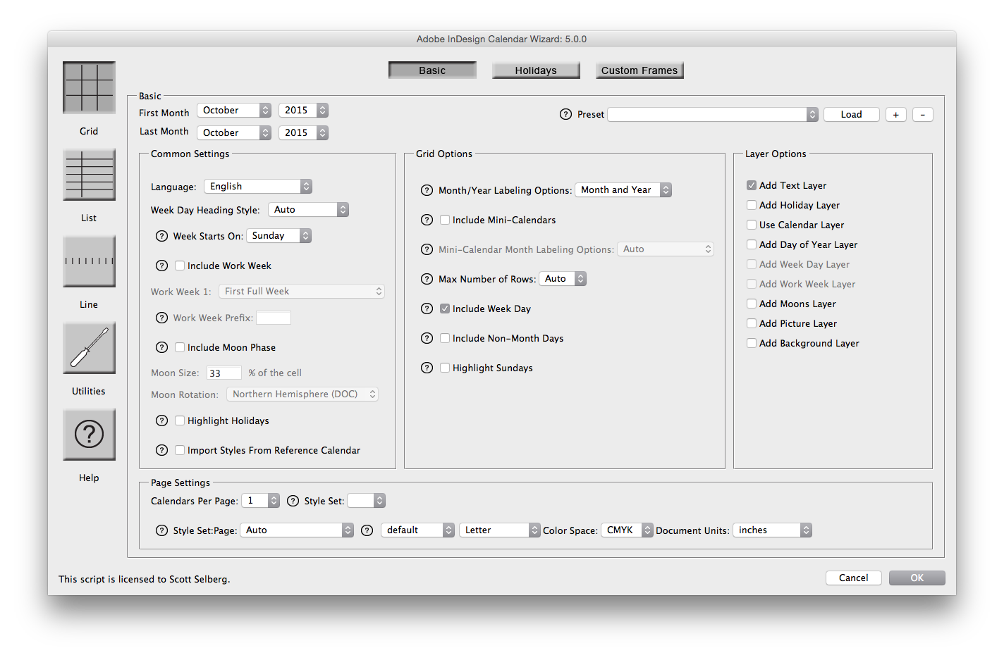
Adjust the SettingsFor this calendar, I'm going to utilize a lot of features. First, set the start month to January and the last month to December to get a 12 month calendar. I'm setting the date rows to 6 because I want every cell on every calendar to be sized the same. I've turned on every calendar and layer option. I also added a couple of holiday sets. |
 |
CommentaryOut of the box, we have a very boring calendar - but everything is ready to style! |
 |
Adding a BackgroundTo add a background, I selected the left A-Master page and created a black rectangle 30.6cm x 30.6cm on Layer 1. |
 |
Changing the Cell Background ColorIn the settings, I activated a Background layer. It created a super-imposed table linked to a unique cell style that utilized a cal_background swatch for the color. I edited the swatch to give the calendar a cream colored background. |
 |
Changing the fontThe text all inherits from the cal_base paragraph style. I set Adobe Garamond Pro as the font for that style. I found the default sizes also too small for the dates and title; however, it was fine for the day of the week. I therefore set the font size in cal_date to 36pt and cal_title to 56pt. |
 |
Setting the Highlighted Holiday ColorI want to differentiate between Sunday's and Holidays so I adjusted the cal_holidayDate swatch to 100% Cyan and 25% Black |
 |
Modifying the Work Week Cell LinesTurning off the frame edges and guides and comparing with and without the black background shows what I consider to be an ugly-factor. The default stroke does not put a border around the work week. With the black background, there is a stroke which extens most of the way across. There are several approaches to this - the easiest for me to tweek was to add a stroke to the top and bottom of the work week cells. |
|
Voila!Adding in a picture on the picture layer and showing all layers gives the final result |
 |


